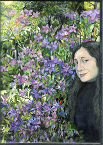
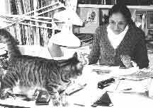
Anita Lobel
Anita Lobel is well known for her colorful
picture books. Her books have appeared on
The New York Times best illustrated list.
She is a recipient of a
Caldecott Honor Medal.
Her childhood memoir "No Pretty Pictures"
was a finalist for the National Book award.
Many of her books have been translated into
other languages.
Click here for a complete list of books.
A Word from the Artist
In 1964, about eight years after saying goodbye to being an art student at Pratt Institute in Brooklyn, New York, I began to work illustrating and writing books for children. My first picture book was published in 1965. Prior to my entering publishing, I had been a textile designer. A not bad way to use drawing and painting skills to and applied commercial art that paid the rent. I did not know then, that the following forty, or so years would eventually be referred to as the golden age of children’s book publishing.
The pictures, at the time I began working, were mostly executed, as black ink or pencil drawings. Laid on top of the base drawing, on two or three separate illustration boards, an overlay of watercolor washes was prepared. This process, if cleverly manipulated, gave on the printed page, an illusion of almost full color illustration.
Even though, my books from that time, don’t exactly blaze in full color, I compensated with the intricacy of the base drawings. This preseparated art was combined at the printing press.
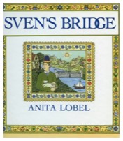
My first book, “Sven’s Bridge”, was executed this way. The colors used for this book were blue and yellow. With an additional overlay of gray, cleverly manipulated, one could obtain a fairly rich palette. Other books. “The Little Wooden Farmer”, “How the Rooster saved the Day”, et. al. were done in the same process. Here the two colors were red and yellow. Again, with grays on an additional overlay, one almost could arrive at a suggestion of a full color picture. It was a challenging and exacting, occasionally satisfying way to work.
There was another, less cumbersome process of color pre separation. It involved the base ink drawing, which was printed in non photographic blue ink on an illustration board, and then painted in full color. This resulted in a richer printed page.
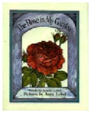
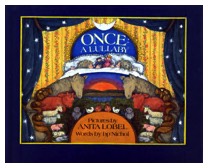
As an artist, I found this process more satisfying. “On Market Street”, The Rose in my Garden”, “Once a Lullaby”, were executed in this manner.
These days, the drawings, the accompanying overlays, are of real interest to teachers and librarians, collectors of graphic art, and especially, to archivists.
Eventually, real full color printing of books moved to presses in China, Japan, and Malasia. Printing became less expensive. Children’s book illustrators were freed to paint. For me it was a godsend. The printing quality in the books was excellent.
Many of my books have been translated into French, German, Japanese and Korean.
When I was an art student, I wanted to paint large heroic paintings or murals with much drama and action. In storytelling pictures in books for children the miniaturization of those visions came to suit me. It has served me well for many years.
Over the years I have won recognition from the Boston Globe, The Washington Post, the NewYork Times. As well as the Caldecott Honor from the American Library Association.